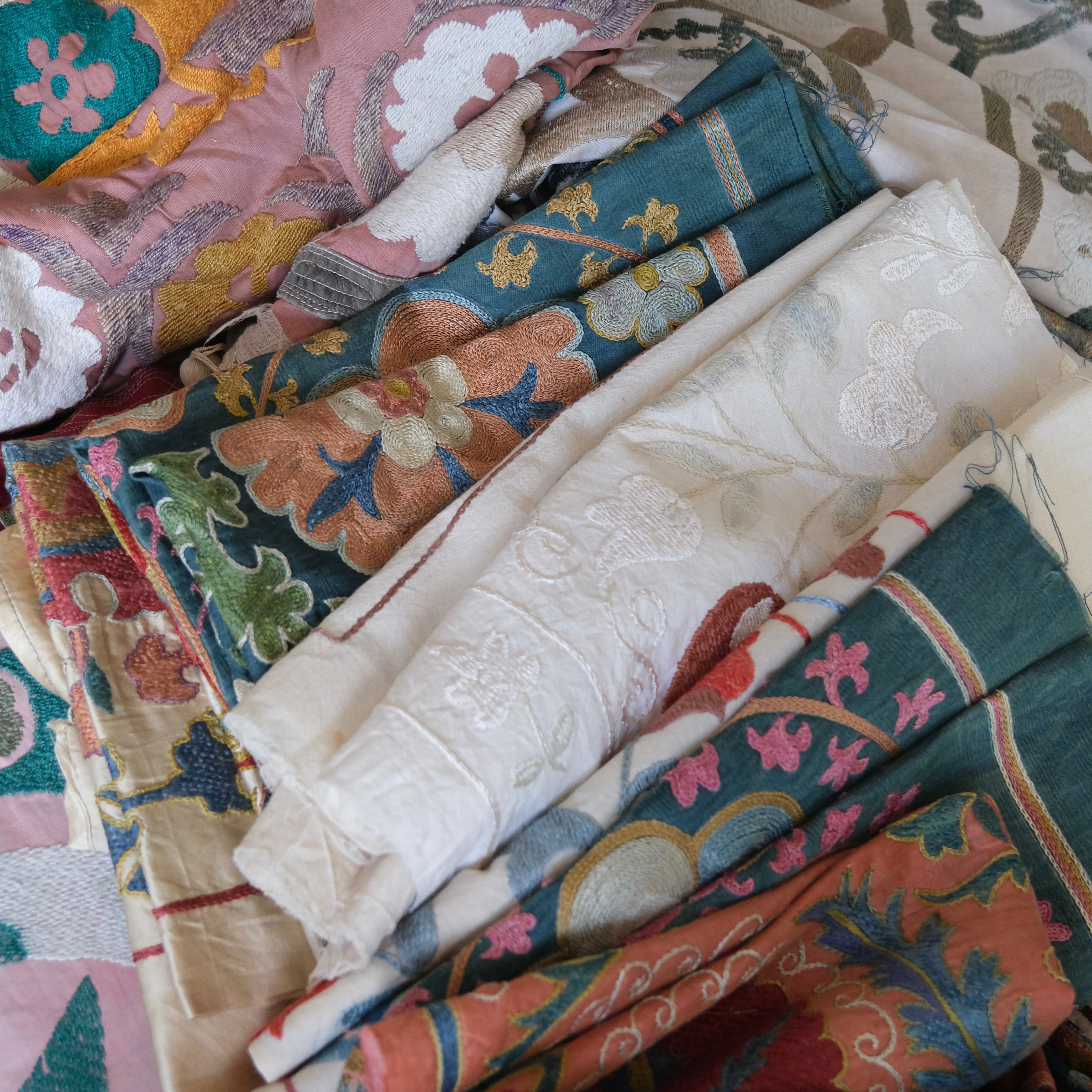
One of the questions I’m asked most about Suze Studio is: How do you select the textiles you frame?
I have the immense privilege to travel to different corners of the world on sourcing trips. It is one of the most rewarding parts of the process, but it can also be overwhelming. So many factors are at play when deciding whether to bring a specific textile home: Is it authentic? What kind of condition is it in? Can I repair it or have it professionally cleaned? Is the price right? Do I have enough cash on me? I often have to make all these decisions in seconds or minutes. Shopkeepers are usually gracious, but you don’t have all day!
Not every beautiful textile is right for framing. When sorting through textiles in markets, antique shops, and private collections, I focus on qualities that help a piece work as framed art.
I don’t always get it right. I made quite a few mistakes, especially on my first sourcing trip in Istanbul, letting myself get caught up in the beauty of vintage textiles without recognising that some were actually quite a project in terms of repairs and cleaning.
But with each sourcing trip, I learn a few more lessons about what textiles I should keep vs let go. The following are the five main things I look for when choosing pieces for Suze Studio.
1. Authenticity and craftsmanship
First, I always pay close attention to the embroidery's quality, and whether it is authentically handmade.
Hand embroidery simply has its own rhythm. You can often spot small changes in the stitching where the maker adjusted the thread, changed direction, or added their own touch to a design. These little differences are what make handmade textiles special.
Authentic pieces often feature traditional techniques, such as dense satin stitches, chain stitches, and layered threads that build rich texture. The textile’s back can be as revealing as the front. Sometimes, turning a piece over quickly reveals whether it was made by hand. Messy backs often indicate handmade work, though some artists tidy them up.
I’m especially drawn to textiles where the stitching shows expression rather than perfection, reflecting both tradition and the maker’s unique skill.
When a textile is framed, its craftsmanship stands out even more. The threads catch the light, and the texture adds depth that printed art can’t match.
2. Striking visual appearance
I’m drawn to textiles that have presence, and sometimes there will be a piece that simply stops me in my tracks.
Markets and textile shops can be overwhelming, but occasionally a piece immediately stands out—whether through bold patterns, confident stitching, or the scale of the design.
Large circular medallions, coarse, twisting vines, bold floral patterns, or strong geometric shapes can all make a piece powerful when framed. I also love designs that feel expressive and a bit imperfect, not perfectly symmetrical.
3. Patina and condition
Many antique embroideries have had long lives as dowry pieces, wall hangings, bed covers, or ceremonial textiles. Over time, they develop gentle fading, soft wear, and a texture that you only get from years of use. This patina can be beautiful when framed. It adds depth and character that new textiles don’t have.
Still, the condition is important. I check that the fabric is strong enough to be mounted and preserved. Small signs of age, such as light fading, minor stitching flaws, or slight colour changes, can add charm. But big tears, heavy stains, or weak fabric can make a piece unfit for framing.
The goal is to find textiles with a rich history that are strong enough, with some reinforcement, to last.
4. Colours and colour contrast
Colour is one of the most important factors that I consider.
Traditional embroideries from Central Asia are known for their vibrant palettes: deep reds, rich indigo, warm saffron, earthy browns, and soft creams. I have an enduring love of colours, but I also recognise that others may not be as enthusiastic about bringing such rich colour into their homes or simply lean into more neutral palettes.
I pay close attention to how a textile’s colours will sit within contemporary interiors. Many antique textiles feature gloriously muted colour combinations that are perfectly suited to modern homes. For newly-made textiles, I tend to gravitate towards soft creams, greens, blues, and reds, which are suitable for a range of interior styles.
But it’s not just the colours that matter. It’s how they work together. I always look for strong colour combinations. Good contrast between the embroidery and the background helps the pattern stand out. A deep pink or red design on ivory cotton, or purple against a warm neutral fabric, can create a dramatic effect when framed.
5. How a textile will work framed
When I look at a textile, I rarely see it just as it is. I’m always imagining what it could look like once it’s framed.
Some pieces are quite large. They are often made as bedspreads or decorative covers. In these cases, I might focus on a striking part of the embroidery for framing as a standalone artwork. I ask myself questions like:
-
How could the piece be divided into sections that each feel like an artwork in its own right?
-
Is there a clear focal point?
-
Would cropping enhance the design?
Framing transforms a textile from something functional into a standalone work, making size, symmetry, and visual balance more important. If I can’t immediately picture it on a wall, I keep looking.
The joy of the hunt
Sourcing textiles is a mix of research, intuition, and a bit of treasure hunting.
Every piece I bring back to the studio has passed through these criteria: condition, composition, visual impact, colour, and craftsmanship. When all five come together, the result is a textile that not only tells the story of its origin but also works beautifully as framed art.

